Client

Sprint, Amdocs

Platform

Desktop, tablet

Role

Senior UX Designer

Propelling Sprint Into Their Next Chapter With an Omnichannel Customer Service POC

Our team partnered with Sprint to re-imagine the telesales app that their reps had been using for nearly a decade. After positive feedback in validations, we continued our partnership to expand the new designs into other journeys and touch points—building an omni-channel experience for customers and sales reps alike.

The Challenge

An antiquated and disjointed software portfolio lead to frustrating interactions that tested the patience of Sprint’s customers and telesales representatives.

RAI (telesales interface) had fallen at least a decade behind current usability standards. Poor visual hierarchy, irrelevant information, and misleading navigation were just the tip of the iceberg.

Discovery

We kicked off our research by interviewing executive and managerial stakeholders to gain insight into the business goals of our project. We then conducted contextual inquiries to uncover the pain points and opportunities within the sales team's current workflow. Here's what we found.

Stakeholder goals

  • More intuitive experience

  • Reduced bounced transactions and call time

  • Quicker training periods

Time consuming calls

  • Average of 6-8 calls per rep, per day

  • Some calls span multiple days and require follow-ups

  • Up to 1.5 hours to complete a sale

  • Frequently restarting transactions if interrupted or a new rep takes over

  • Customers are regularly left on hold while the rep searches for notes or makes updates

Reliance on multiple tools

  • Reps were using many tools to get various jobs done

  • Reps go around the system to get credit for the sale (impacts KPI and speed)

  • Reps don’t trust internal systems and use Sprint.com to get accurate product details, coverage maps, promotions, etc.

Inadequate software

  • No way to save transaction progress

  • No asynchronous paths

  • Changing simple variables requires restart of the entire order

  • No guided next steps

  • No integration with phone system so reps verbally ask customers for data (numbers, addresses, PINs, etc)

Project Goals

After discovery, we collaborated with our stakeholders to validate our understanding of the goals and pain points of each primary workflow, to identify and prioritize opportunities, and to sketch out potential solutions. With our new insight we generated project goals.

01

Create asynchronous workflows so that reps can string multiple tasks together in one transaction

02

Update the UI to better reflect the Sprint brand and create a more accessible and scalable visual language

03

Create guided workflows so that reps can move quickly, backward and forward, without having to hunt down their next step

04

Allow reps to save progress, undo actions, and make changes from the cart without starting the transaction over

Ideation

Now that I understood the goals and opportunities of the project, it was time to start building a solution. My first step was to take the primary workflows, which spanned multiple tools, and visualize them as an end-to-end experience within a single app.

When visualizing user flows, my first step is to take the most complicated flow, map it out, and see how the other flows overlap it. This approach quickly orients me within the user environment and let's me see where "core" screens can be reused. When creating new user flows, I prioritize simplicity and reusability in my early iterations.

Later on, unique tasks might require unique branches within the flows. For example, the 'Add a Line' flow asks the customer to fill out a unique questionnaire, and gives them the option to use a device they already own. These forms created unique branches away from the 'core' flows.

After mapping out the user flows, I wanted to sketch key interactions to get a better understanding of how the UI would fit together, and where individual components might be unique or reusable across multiple flows.

Testing Prototypes

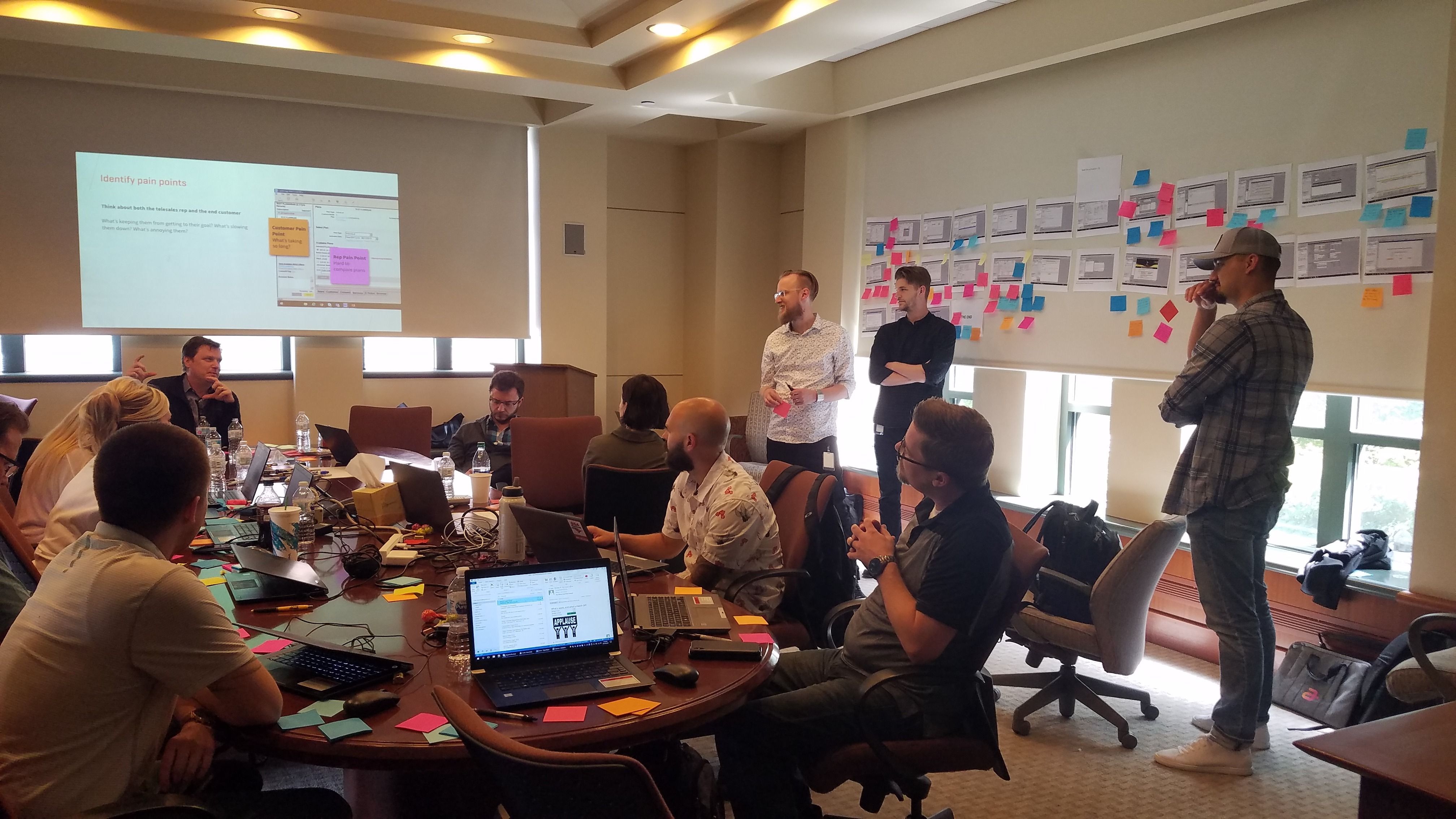
The Rapid Iterative Testing & Evaluation (RITE) method is a process for identifying and remedying key issues in the early stages of a particular design. Issues are identified on the testing days and time is allotted between each day, or testing cycle, to create solutions for the issues that arise and allow those solutions to be re-tested by participants.

Using this method, we tested each of our four workflows individually—making workflow-specific adjustments between testing days, and global adjustments between each week of testing. Here are some of the key designs that were tested:

Subscriber Dashboard

The goal of the subscriber dashboard was to surface relevant information as early as possible, empowering the sales rep with all the context and tools they may need to assist their customer. It also succeeds as the primary way of navigating downstream from the account into the subscribers and their devices.

“I think this will be a lot easier for people to pick up on. Because it’s more like a website.” -Participant

Line Detail

Each individual line has a detailed overview that outlines the status of plans, devices, and services, giving next-best-action guidance for the sales representative.

“This is something we have to dig for and now it’s right there. We know they have protection and they have insurance on their phone.” -Participant

Step Tracker

While the rep is making changes to the account (adding lines, upgrading devices, etc.) we've displayed a dynamic step tracker at the top of the UI.

This helps set expectations of what their next step is, but most importantly, it displays what decisions were made on each finished step, and gives them a quick path to move backwards if the customer wants to make changes to a previous decision.

This revolutionized the sales rep's experience. In their current experience, if the customer changed their mind about the color of the phone they were upgrading to, the sale's rep would have to restart the transaction, frantically recreating all the previous changes they were making by memory or referencing notes.

Device Wall

Search, filter, and simple selections speed up the selection process in a familiar format.

“This almost looks like what I’d do on sprint.com—I help customers with ordering phones online all the time, it’s easier than what we do in the store.” -Participant

Device Detail

All the options for the device are presented in the same way a customer would see them on Sprint.com. Reps no longer have to pull up the website to find item descriptions.

Plan Wall

Logical plan sorting brings the best plan to the forefront, showing any current plan and making comparison between plans simple.

“A customer could operate this.” -Participant

Service Wall

Searchable and intuitively labeled service list with descriptions enhances communication with the customer, so that time previously spent on navigation can be spent upselling Sprint's offerings.

“This is perfect. We don’t have this currently. It’s all in one place. I love it. I think it’s really good.” -Participant
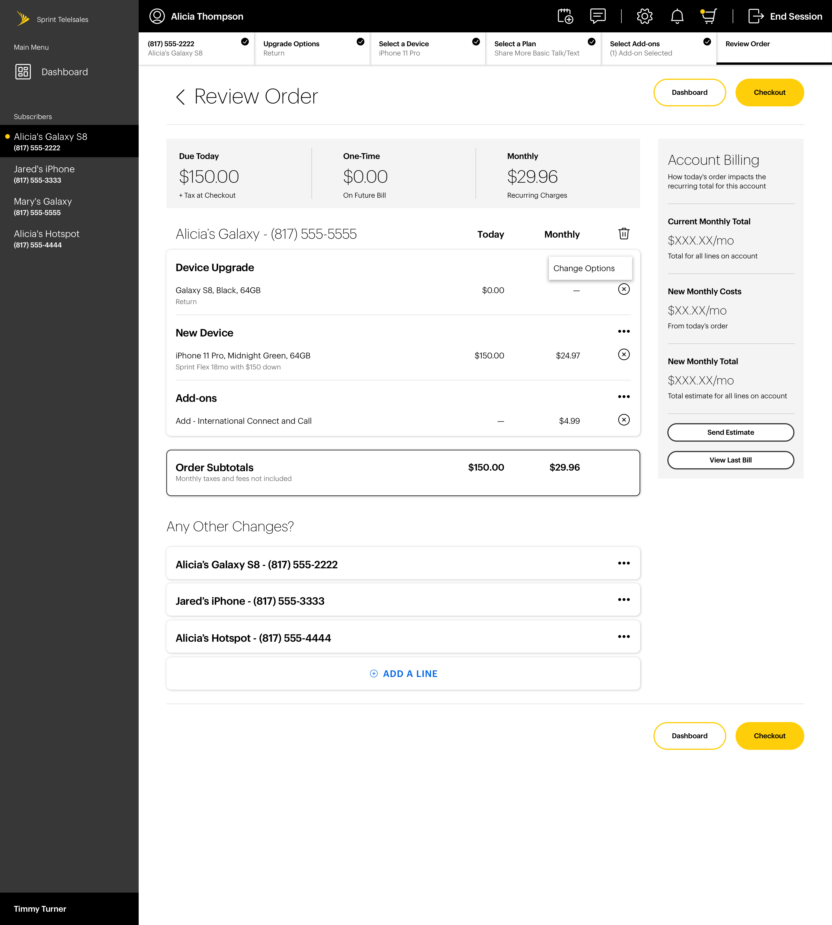
Review Order (Cart)

The cart breaks down the transaction into intuitive categories, making it easy to communicate to the customer what changes they should expect to see after the call.

It also separates the owed payments into three categories, so the customer is never blindsided by changes to their monthly bill.

“Going straight to the cart is very practical. Right now I have to click through three, four, five, six screens to get to the cart.” -Participant

Results

We put our prototype in the hands of 12 telesales reps and asked them to complete four primary tasks. Here are some of the results:

100%

of participants completed the suggested tasks with no major issues

83%

of participants said they'd expect to sell more add-on's and services with our experience

100%

of participants said they'd expect the ability to make changes from the cart to significantly increase their call turnover rate

100%

of participants said the step tracker would significantly increase their call turnover rate

Conclusion

While the feedback we received was positive, our POC was just the beginning of what we'd intended to be a full overhaul of the experience. We continued to design and introduce new features, such as Interaction History, to further empower sales reps with access and knowledge that could increase call turnover rates and help them close the sale.

However, Sprint was ultimately acquired by another company, and ownership of our project was passed on to a new team.